
-

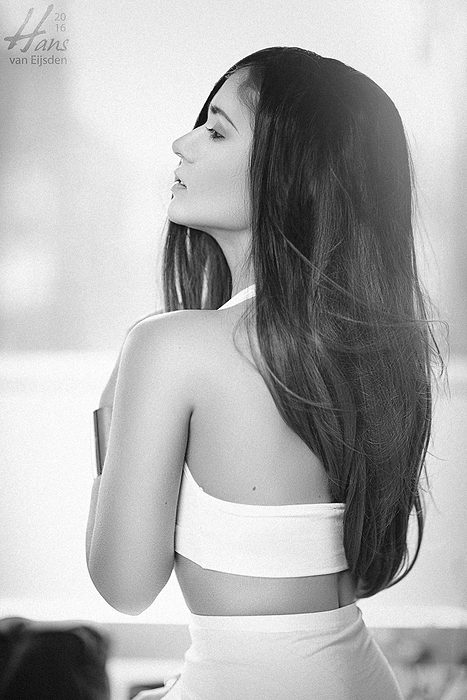
Tamara Terzic (1/400s at f/1.4 on 85mm) – Studio Hans van Eijsden Photogra, Zwolle, Netherlands
-
Lips (1/200s at f/11 on 200mm) – Studio Hans van Eijsden Photogra, Zwolle, Netherlands
-
Tamara Terzic (1/250s at f/1.4 on 85mm) – Studio Hans van Eijsden Photogra, Zwolle, Netherlands
-

Tamara Terzic (1/200s at f/11 on 200mm) – Studio Hans van Eijsden Photogra, Zwolle, Netherlands
-
Tamara Terzic (1/2000s at f/2 on 85mm) – Studio Hans van Eijsden Photogra, Zwolle, Netherlands
-
Tamara Terzic (1/400s at f/1.4 on 85mm) – Studio Hans van Eijsden Photogra, Zwolle, Netherlands
-
Tamara Terzic (1/1000s at f/2.2 on 85mm) – Studio Hans van Eijsden Photogra, Zwolle, Netherlands
-
Tamara Terzic (1/400s at f/1.2 on 85mm) – Studio Hans van Eijsden Photogra, Zwolle, Netherlands
-
Tamara Terzic (1/5000s at f/1.2 on 85mm) – Studio Hans van Eijsden Photogra, Zwolle, Netherlands
-
Tamara Terzic (1/400s at f/1.2 on 85mm) – Studio Hans van Eijsden Photogra, Zwolle, Netherlands
-
Tamara Terzic (1/1250s at f/2.2 on 85mm) – Studio Hans van Eijsden Photogra, Zwolle, Netherlands
-
Tamara Terzic (1/320s at f/1.4 on 85mm) – Studio Hans van Eijsden Photogra, Zwolle, Netherlands
-
Tamara Terzic (1/4000s at f/1.6 on 85mm) – Studio Hans van Eijsden Photogra, Zwolle, Netherlands
-
Tamara Terzic (1/320s at f/1.4 on 85mm) – Studio Hans van Eijsden Photogra, Zwolle, Netherlands
-
Tamara Terzic (1/1600s at f/2.2 on 85mm) – Studio Hans van Eijsden Photogra, Zwolle, Netherlands
-
Tamara Terzic (1/400s at f/1.2 on 85mm) – Studio Hans van Eijsden Photogra, Zwolle, Netherlands
-
Tamara Terzic (1/2000s at f/2.2 on 85mm) – Studio Hans van Eijsden Photogra, Zwolle, Netherlands
-
Tamara Terzic (1/1600s at f/1.6 on 85mm) – Studio Hans van Eijsden Photogra, Zwolle, Netherlands
-
Tamara Terzic (1/320s at f/1.4 on 85mm) – Studio Hans van Eijsden Photogra, Zwolle, Netherlands
-
Tamara Terzic (1/1250s at f/2.2 on 85mm) – Studio Hans van Eijsden Photogra, Zwolle, Netherlands
-
Tamara Terzic (1/2500s at f/1.8 on 85mm) – Studio Hans van Eijsden Photogra, Zwolle, Netherlands
-
Tamara Terzic (1/400s at f/1.2 on 85mm) – Studio Hans van Eijsden Photogra, Zwolle, Netherlands
-
Tamara Terzic (1/2500s at f/2 on 85mm) – Studio Hans van Eijsden Photogra, Zwolle, Netherlands
-
Tamara Terzic (1/1600s at f/1.8 on 85mm) – Studio Hans van Eijsden Photogra, Zwolle, Netherlands
-
Tamara Terzic (1/200s at f/11 on 200mm) – Studio Hans van Eijsden Photogra, Zwolle, Netherlands
-
Tamara Terzic ({shutter}s at {fstop} on {focal_length}mm) – Studio Hans van Eijsden Photogra, Zwolle, Netherlands


Colors: Yes or No?
| 26 imagesThis post is also available in:
 Dutch
Dutch
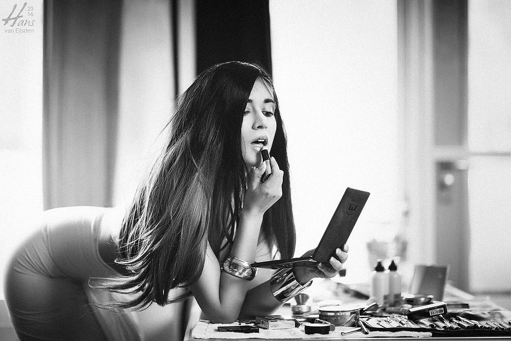
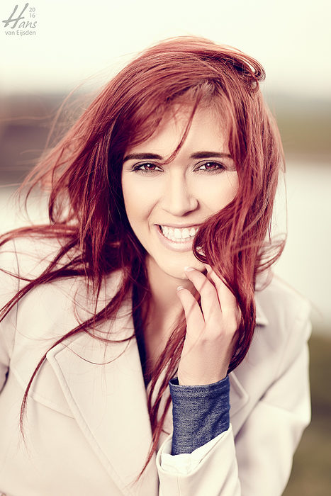
Sometimes, as a photographer, it’s difficult to open myself for my own feelings, my intuition. What do I want? And what does the client/customer want? It’s all about attention, first impression, communication. I often ask myself the question: “Is it the character? The expression? Or is it another point of interest, like colors or high contrast or lines or shadows?”. And sometimes it’s difficult to choose. But other times the target is clear to me and to the client: vivid popping colors or high contrast grey tones.

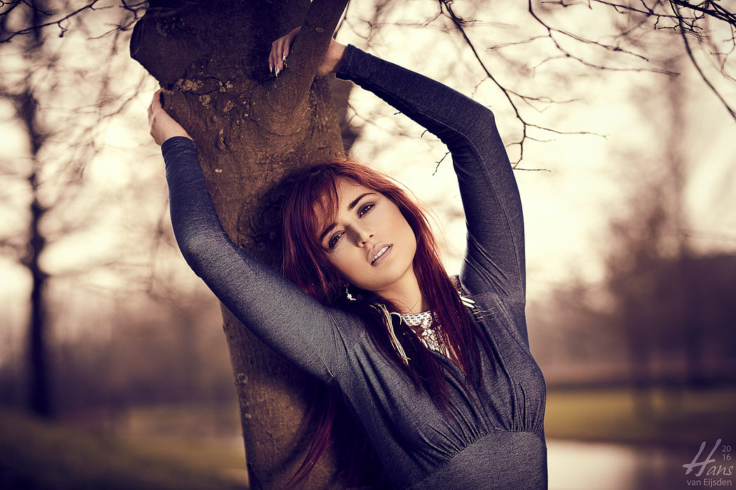
Tamara Terzic (1/400s at f/1.4 on 85mm) – Studio Hans van Eijsden Photography, Zwolle, Netherlands
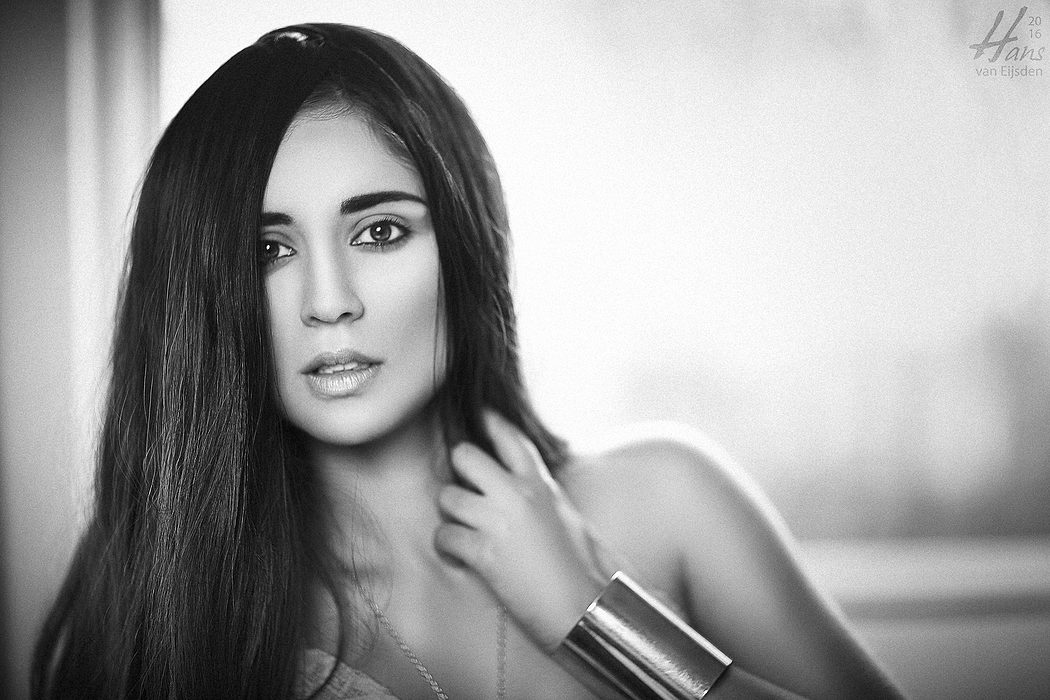
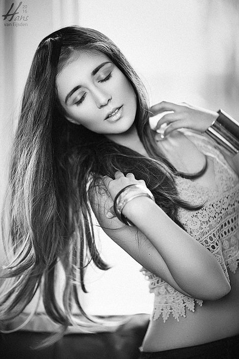
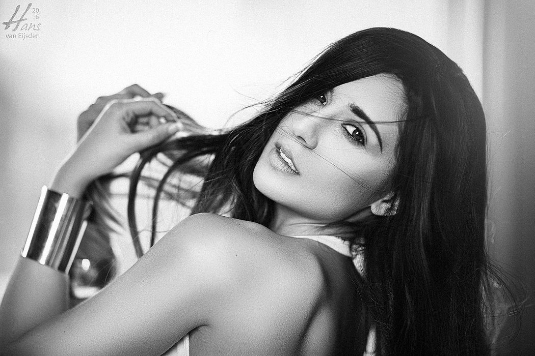
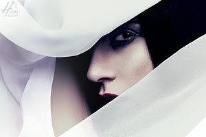
This time with Tamara we tried to combine and evaluate those concepts during the day. We started with some simple basic greyscale (“black/white”) work, using the ambient light as a rim light and using an Elinchrom ELB 400 with Deep Octa on its lowest settings as key light from the front, to shape her face and body with the light and shadows. It was all about expression, character, pose. And immediately we saw the impact: no distracting colors but purely grey tones, gently transitioning from black to white.
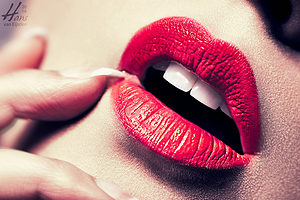
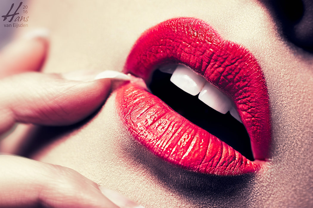
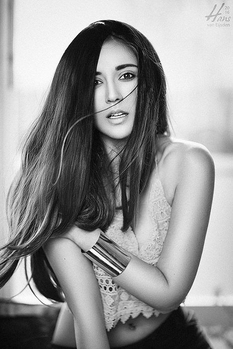
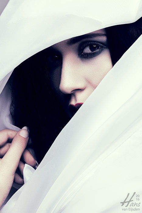
Lips (1/200s at f/11 on 200mm) – Studio Hans van Eijsden Photography, Zwolle, Netherlands
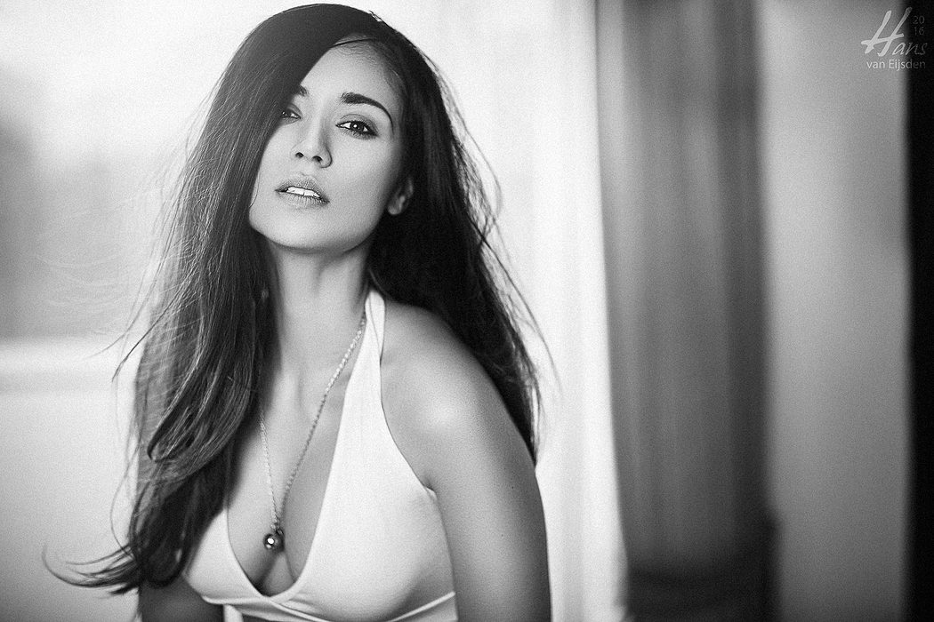
But other times it’s great to let other things do the work. In this case with her beautiful vivid red lips: they were a perfect candidate to make an image which screams for attention. By making use of a harder and smaller light source (a silver beauty dish with silver deflector) I could make some denser edgy shadows, letting the white of the teeth come through being more pronounced and creating some sharp crispy highlights in the lips. Most interesting: when converting that image to greyscale (black/white), all of the impact vanished and the image lost all of its pureness and expression: the image simply didn’t work anymore. So, this time the vivid red color was the best choice. And the image did very well, also on 500px, Facebook, LinkedIn, Instagram, Twitter, Flickr, Pinterest and (yes it still exists) Google+. It’s nice to receive feedback through social media because then I know what works and what doesn’t. And it keeps the team motivated.
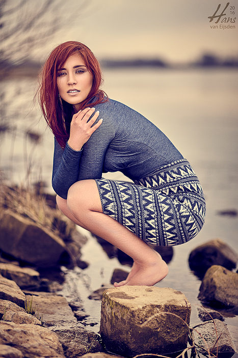
Tamara Terzic (1/2500s at f/2 on 85mm) – Studio Hans van Eijsden Photography, Zwolle, Netherlands
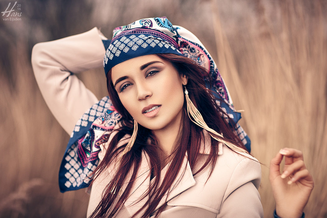
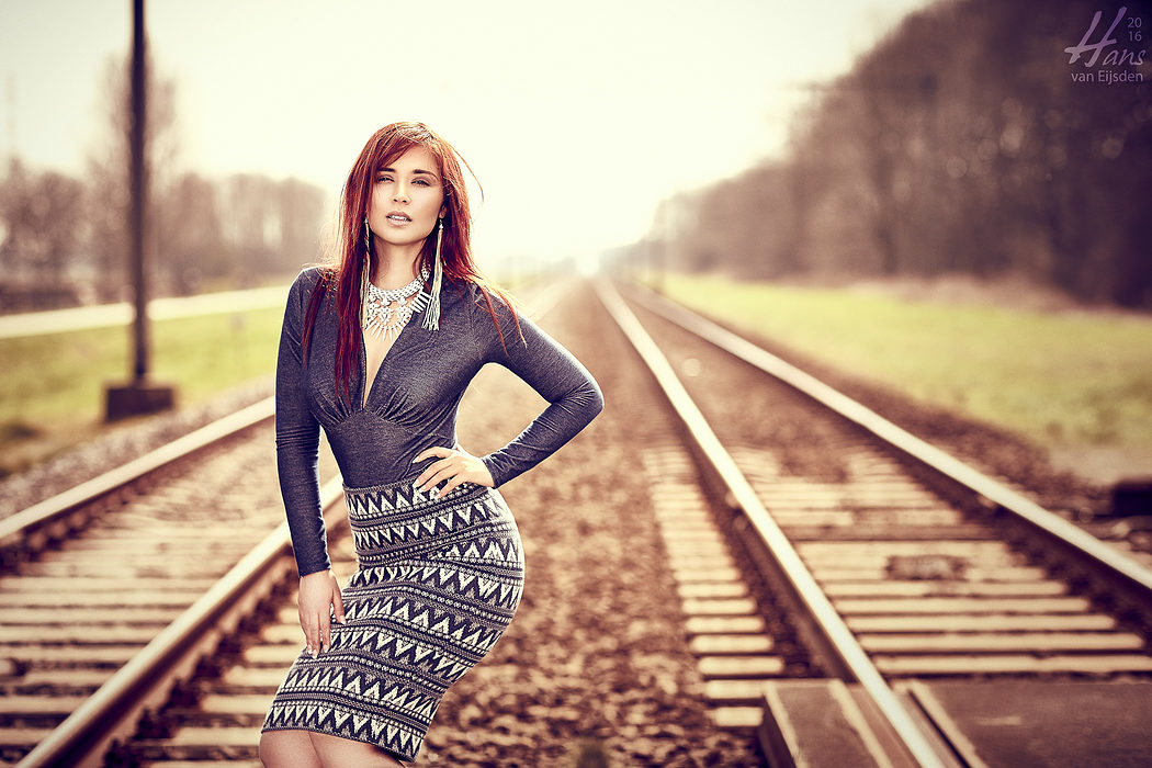
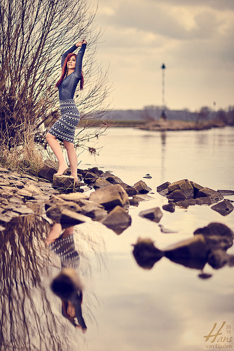
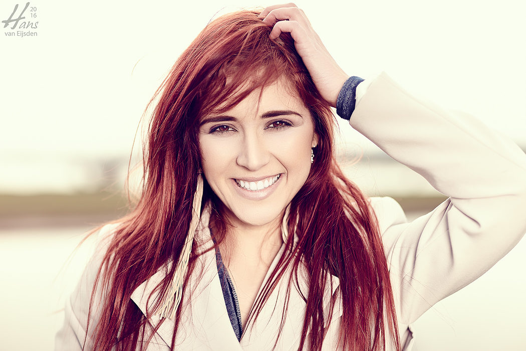
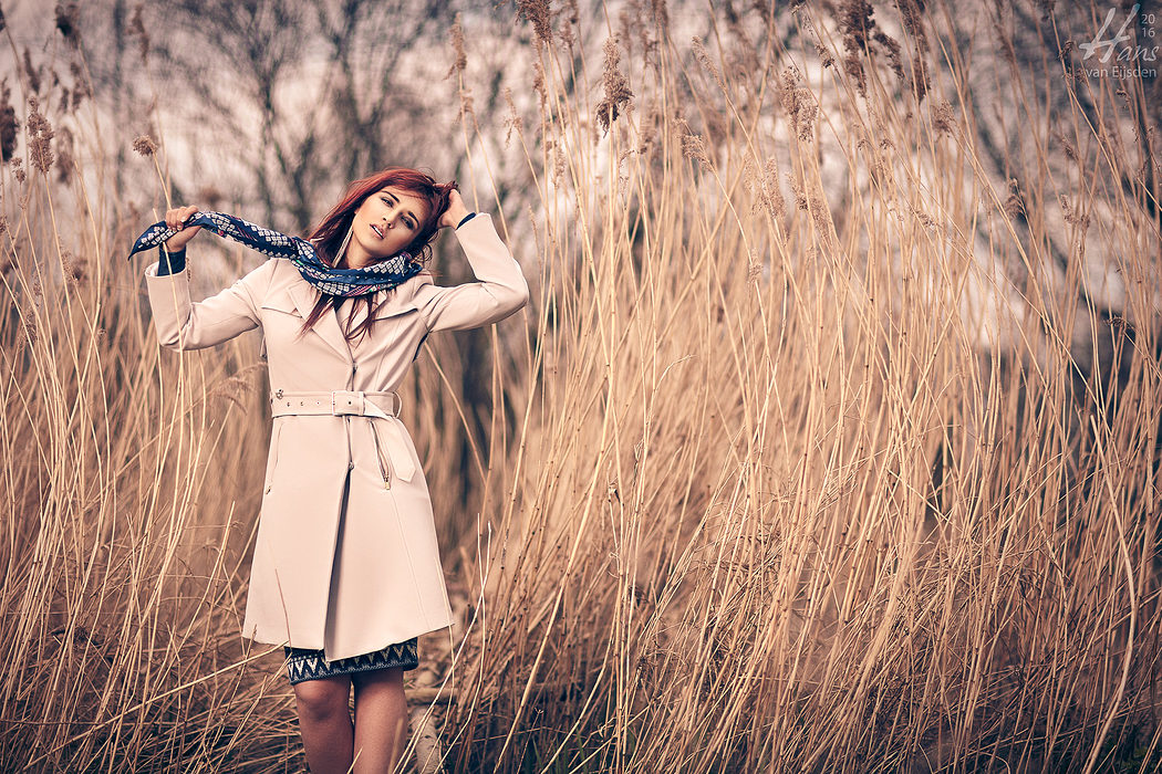
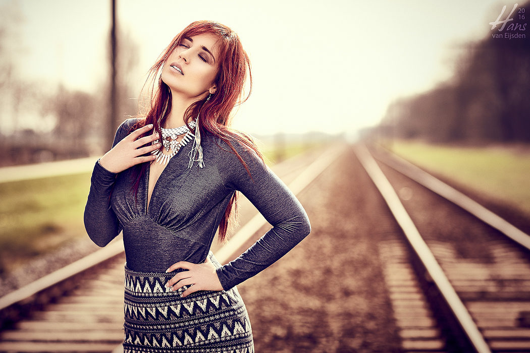
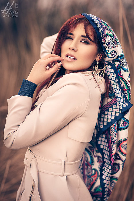
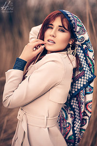
And sometimes, in rare situations, neither of the two options work very well. No vivid popping colors and no greyscale images. Like in this case: I really had to make use of complementing colors, opposite to the blue tones around her hair. So, I had to try to find something between yellow and brown and we found it outside as you can see. The only thing I had to to was making a good color calibration with the ColorChecker on the second portrait warming preset, and in postprocessing some cooler toning of the shadows through Curves.
Tamara Terzic (1/200s at f/11 on 200mm) – Studio Hans van Eijsden Photography, Zwolle, Netherlands
Those actions made the colors way more connecting, making the image feel as whole. Of course, there’s more behind the scenes. By using my 85mm f/1.2 glass I could create an extra shallow depth of field, with painterly creamy background transitions. And by using my portable studio light (again the Elinchrom ELB 400) with the large Elinchrom Deep Octa with extra diffuser it was possible to even out her skin tones, while maintaining the contouring of her face, done by Martina Kató, one of my favorite makeup artists.
So, as you can see, there’s really no “color is bad” or “greyscale (black/white) is always more beautiful”. It always depends on the situation, the wish of the customer, the expression, the styling and the creative vision of the team. There’s no right or wrong. But sometimes the final result and the final conversion takes place after many takes during postprocessing. Like this time. 😉
Leave a Reply